Real estate branding for House and Home Real Estate was completed in 2017 but the website just went live.
Kathy Corey is a realtor and broker in North Texas. She launched her own brokerage in 2017. For the design she wanted a clean logo and her one request was that we work a dragonfly into the design.
First step is always gathering design inspiration:
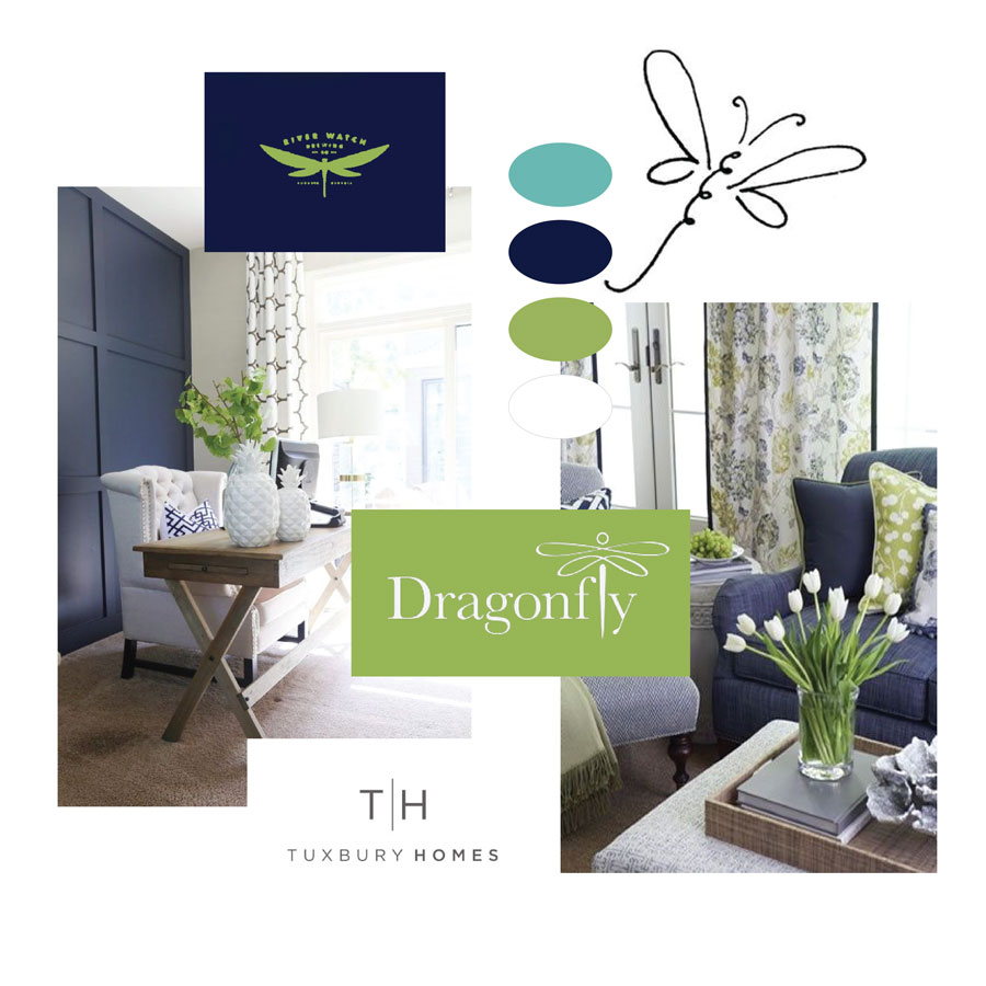
The color palette was a beautiful combination of navy and lime green. The navy represents sophistication while the green brings in a sense of fun. The combination of fonts is a continuation of this combination of formal and comfort.
Real Estate Branding
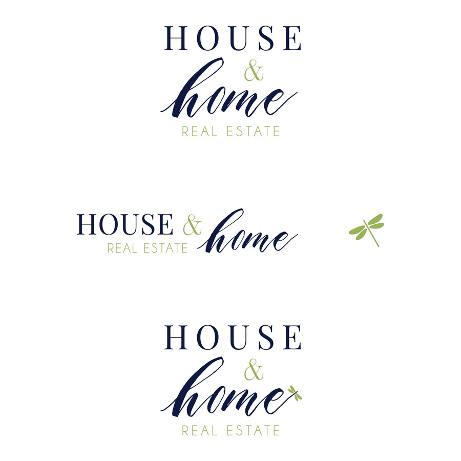
The final design includes both a handwritten font and a serif font. The serif font ads structure while the handwritten font adds relatability to the logo design. The little detail of the dragonfly can be included or omitted depending on where and when the logo is being used.
We incorporated the dragonfly into the business card design and the listing signs. How fabulous does this yard sign look?

Real Estate Website Design
The House and Home Real Estate WordPress Website allows visitors to easily search listings throughout North Texas and connect with Kathy. The design is clean and simple to keep the attention on home listings.
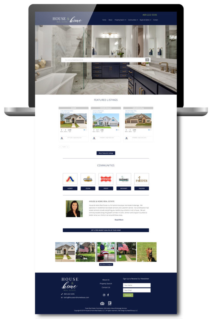
To experience the newly launched website yourself, head over to HouseandHomeTexas.com.
Ready to work with KateOGroup
What a neat behind the scenes look at the real estate branding! It’s so interesting seeing the initial inspiration to the final results. Well done!
I love seeing this design process and the thought that went into it. Always so hard to pick fonts and colors, these pair perfectly together. Great job on this real estate branding project!
Oh my goodness, I love the idea of real estate branding. This looks gorgeous and will draw the eye. Great work!
I love seeing the behind the scenes look at this real estate branding!! You do such a great job!