• Skip to main content

KateOGroup

Just another WordPress site

Moodboard Monday: Homey

March 21, 2016 by kateogroup

Whenever I’m brainstorming a new project, I like to start with a moodboard.  It really helps me to establish the direction and message for the upcoming design.  I haven’t meet with my clients yet, so I’m not sure this moodboard will be what I use going forward but still thought I’d share it incase it provide inspiration for someone else!

Homey_Moodboard

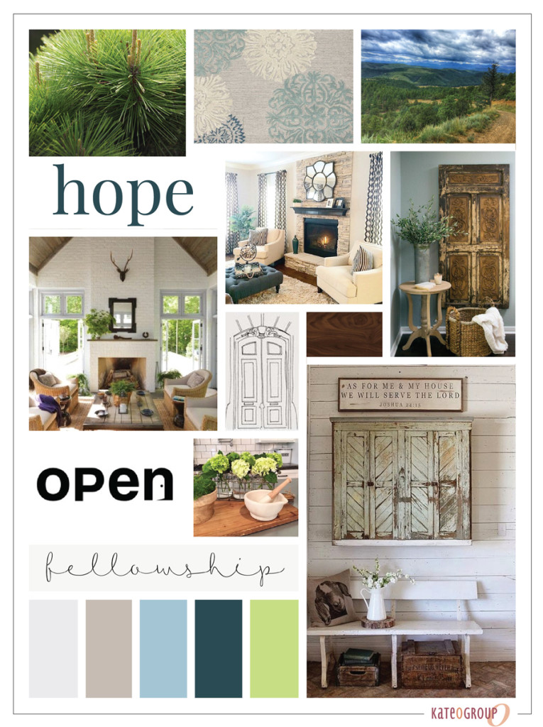
Through this moodboard I wanted to establish a “homey” feel with the opportunity for personal touches throughout the design.  This is the first step in a rebranding and website design.

Want to see even more sneak peeks of the projects I’m working on?

Follow me on Instagram

or Snapchat: KateOGroup

Filed Under: Blog, Branding & Design Tagged With: brand design, branding, Branding Design, logo design, moodboard

Rebrand: Anders Group

March 9, 2016 by kateogroup

I’ll confess that before working with the Anders Group on their rebrand, I didn’t really understand what a travel healthcare job was.  Essentially as a healthcare professional (nurse, therapist, etc) you take short term assignments that are approximately 13 weeks and your assignment could be anywhere in the US.  How cool is that?  You get paid to travel and experience living in different cities.  Anders Group does all the work finding assignments, getting you to the assignment and setting up a place for you to live.  If you know anyone interested in this type of job I highly recommend you look into Anders Group!

Because Anders Group already had a logo it was important to stick with the same color scheme and just give the logo a more up-to-date look but we didn’t want to completely abandon the original design.  Here is the final design they selected:

Anders-Group-Logo-&-Elements

Anders-Group-Business-Cards

Once the logo was chosen it was time to get started on their marketing materials.  Designing the marketing pieces was my favorite part of this project.  Anders Group really wanted unique items that required out of the box thinking. Instead of a big brochure full of company information they opted for a folder with information sheets that could be customized for each event they attend.

Anders-Group-Marketing-Materials

Anders-Group-Folders-exterior

Anders-Group-Folder-with-Information-Sheets

Another part of the project was creating a brochure for the Anders Group.  Rather than a traditional tri-fold brochure we designed a square tri-fold brochure with a cutout on the front panel.

Anders-Group-Brochure

Anders-Group-Brochure-Open

Anders-Group-Marketing-Materials

Thanks to Emily for working on this design and copywriting project with us!

Filed Under: Blog, Branding & Design Tagged With: Branding Design, rebrand

Logo Design: Merrill B. Domas

November 3, 2015 by kateogroup

The Logo Design for Merrill B. Domas was another project I worked on with Lindsey Edison Branding & Design.  The idea and concept for Merrill B. Domas Antiques & Interior Design was centered around art deco design and using classic colors.  This was such a fun design I went about over the top on design ideas, but here’s a peek at that final five designs:

Logo Design: Merrill B. Domas Concepts

Merrill-B.-Domas-Logo-&-Elements

Once the logo design was complete it was time for the business card design.  I love the minimalist look of this modern design and how that translated to the finished card design.

Merrill-B-Domas-Business-Cards-1

Merrill-B-Domas-Business-Cards-2


If you are looking to get started on branding for your business we would love to talk with you.  Leave a comment below and I will email you to set up a time to talk.

Filed Under: Blog, Branding & Design Tagged With: art deco, black and gold, branding, Branding Design, business card design, business cards, logo design, retro logo

Logo Design: Lindsey Edison

September 17, 2015 by kateogroup

I met Lindsey Edison at the beginning of the year when she asked me to create some graphics for a client of hers.  Over the next couple of months more projects have come up and she decided it was time to officially launch her business: Lindsey Edison | Branding & Design.  Just as Lindsey does for her clients, she had a clear vision for what her brand and logo design should look like.  The inspiration started with two pieces of inspiration she sent me as we began the logo design project.
Lindsey Edison Logo Inspiration
Lindsey Edison Logo Concepts

My favorite idea while working on this logo design was using Lindsey’s initials as the texture on the pineapple but ultimately the pineapple was going to be so small that the design didn’t work out as well as I’d hoped.  After working through a few concepts we both agreed the banana leaves should just be an element for her brand instead of being incorporated into the logo design.  In the end, the final logo design chosen was:

Lindsey Edison Logo and Elements

We used gold foil on the front of Lindsey’s business cards and I absolutely LOVE the end result!

Up close of Lindsey Edison Branding and Design Business Cards

Front and Back of Lindsey Edison Business Cards

Be sure to check out Lindsey Edison Branding and Design over on Facebook to keep up with all of her projects.

Filed Under: Blog, Branding & Design Tagged With: Brand Elements, branding, Branding Design, gold foil, logo design

  • « Go to Previous Page
  • Go to page 1
  • Go to page 2

Copyright © 2020 · Aspire Pro on Genesis Framework · WordPress · Log in